 Home
HomeWeb design
I develop websites from web design to technical implementation for small to medium-sized companies and institutions, and I also keep an eye on SEO aspects.
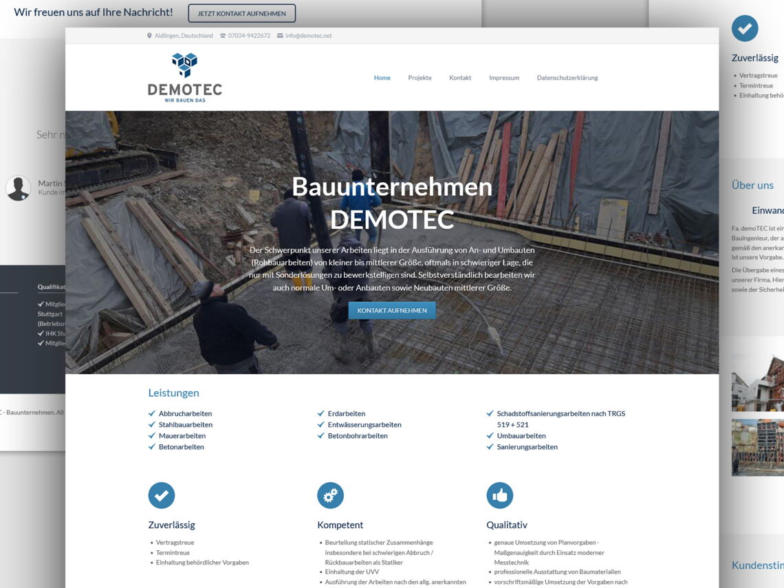
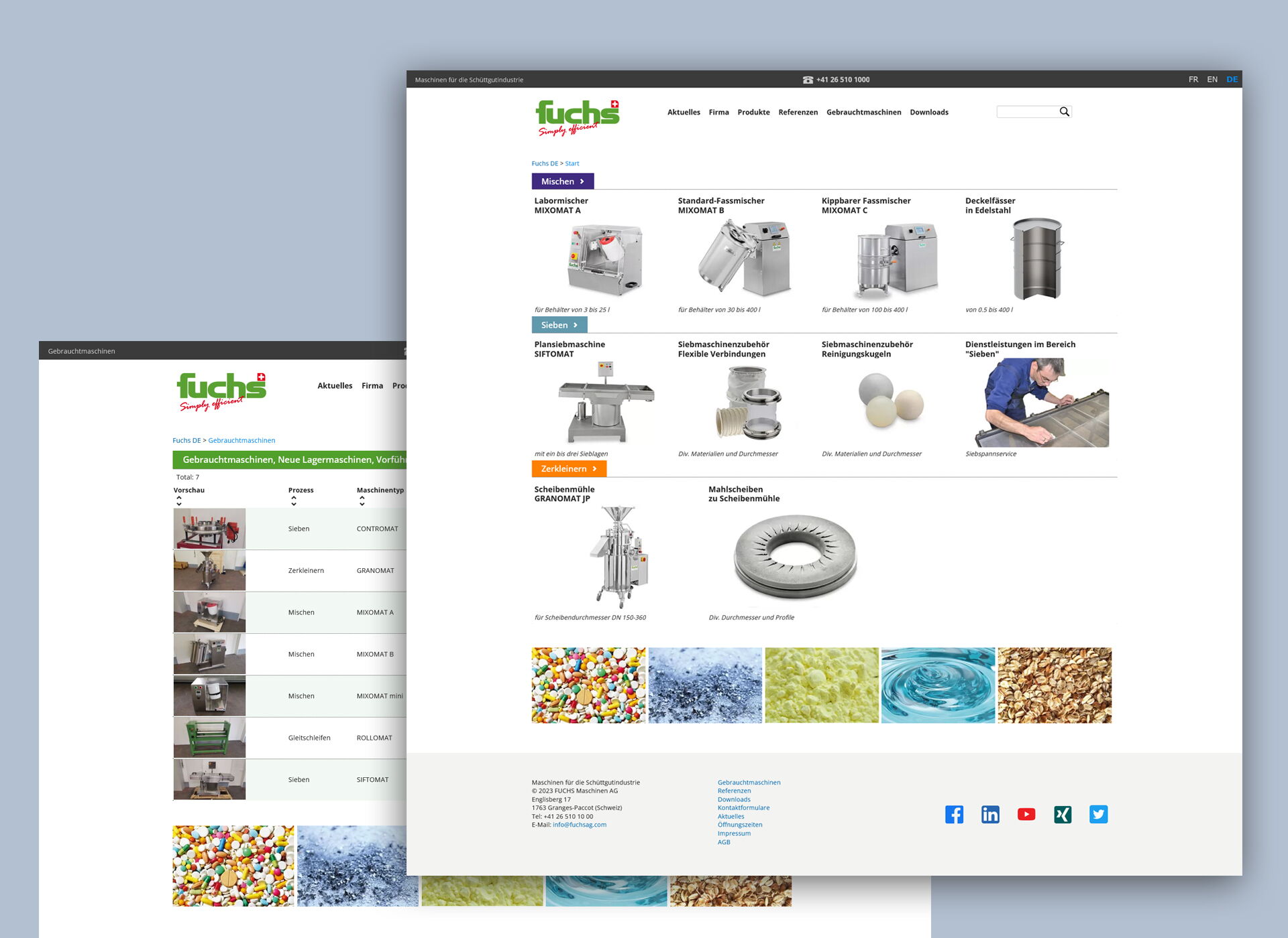
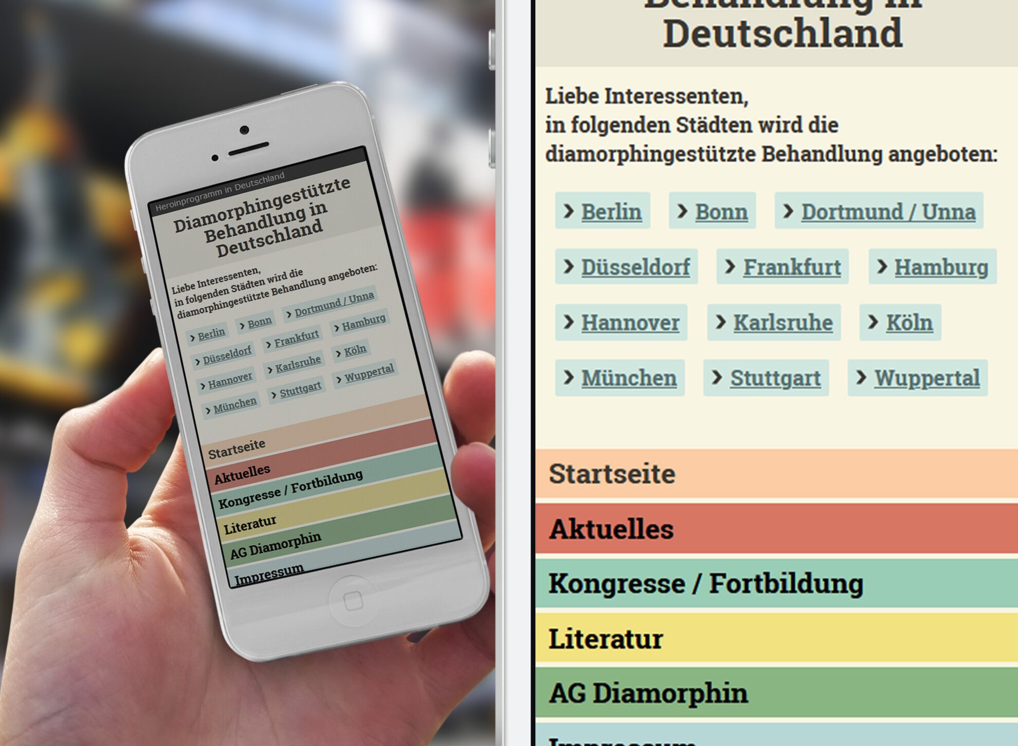
My web design clients include among others mechanical engineering companies, temporary work agencies, travel companies, IT companies, craft businesses and doctor's offices.
I specialize in the CMS Contao, which I've been working with for over 10 years. I use Contao for most websites.
See a selection of my work:


SEO
A well-conceived SEO (search engine optimisation) can help your website to a better ranking in the search results of a search engine. A better ranking improves your chance to have more visitors on your website. Compelling content and backlinks will have a positive impact on your ranking.
But there are also some technical SEO aspects to be considered. That's why I take them already into account during design development and technical realisation.
If your web design is compelling and encourages users to linger longer than a cursory glance, this will result in a better search engine ranking and finally in more visitors and better conversions.
Website maintenance
Only a website that is regularly maintained can be successful. You, too, can update the content of your website yourself after a short introduction to the Contao CMS.
However, if you don't have the time or inclination, I can take care of regularly updating your website for you at a fixed price - simply, quickly and on demand.
Website updates
Even after your website has gone live, I take over the maintenance and make regular back-ups of your website. A successful website has to be updated on a regular basis to provide the best user experience possible.
I'm happy to advise you on how to built a successful website especially for your business needs.
Do Any of the Following Apply to You?
- You want to update your web design, as well as having it optimised for smartphones and tablets
- Your website needs to be tailored to the needs of your clients and you'd like to know how you can improve it?
- You want to be able to update your website yourself without having any knowledge of programming?
- You like to have both your internet presence and your print media from a single source?
- You have a small to medium-sized enterprise or you manage an institution or an association?
- You are looking for a freelance web designer who uses Contao for your advertising agency ?
- You are looking for a web service provider near to Ulm in Germany?
Then we should talk about your web project.
Web design services
- User-friendly website design tailored to your target audience
- Search engine-friendly implementation, search engine optimisation (SEO)
- A website using a CMS (Contao), which you can update yourself
- Responsive web design
- Landing page design
- PDF manuals on how to use the Contao CMS tailored to your needs
- Website maintenance and service
- Updating of content at a fixed price
Social Media